My Role
Senior Product designer
Tools
Figma, notion
Timeline
April 2026
Context
As Piggyvest Business expanded, onboarding became one of the biggest barriers to growth. Businesses were required to provide compliance documents, verify directors, complete identity checks, and coordinate multiple stakeholders before gaining access to the platform.
For Limited Liability companies which data showed were the largest customer set, these requirements often stretched onboarding across several days, resulting in high drop-off rates, increased support volume, and operational activities. Report from the data team shows that a huge percentage of people get stick at onboarding and eventually get frustrated and stop the process
I led the redesign of the onboarding experience with a clear objective: improve activation by reducing KYC friction without compromising compliance requirements. This meant rethinking not just the interface, but the entire onboarding journey from document preparedness and verification workflows to progress visibility and time to value.
Existing Piggyvest Business with high friction onbooarding flow
Before exploring solutions, I mapped the end-to-end onboarding experience to understand where friction happens. What emerged was a lengthy, compliance heavy journey with multiple verification steps, external dependencies, and manual review processes. This exercise helped uncover the points where users were most likely to get stuck, abandon onboarding, or require support intervention


Key Iterations
01. Giving Businesses Clarity Before They Begin
One of the biggest sources of abandonment occurred before users even reached onboarding. Businesses could create an account without knowing what documents would be required for verification. This created surprise, frustration, and early abandonment.
I introduced a dedicated onboarding entry point that clearly outlines the onboarding process and allows users to identify their business type before proceeding. I also moved business type selection into the signup experience and surfaced onboarding requirements before account creation.
As users selected their business type, they could immediately see the documents and verification requirements associated with that category.
This gives businesses visibility into requirements upfront and helps them prepare before starting verification.
Why this matters
The goal wasn't simply to collect business type information earlier, It was to eliminate uncertainty.
By making requirements visible upfront, onboarding became a process businesses could prepare for rather than discover as they progressed through it.
Outcome
Improved document preparedness
Reduced surprises during onboarding
Set clearer expectations before account creation
Removed a major source of early friction


Dedicated onboarding entry point that clearly outlines the onboarding process and allows users to identify details they would provide before proceeding
Business Type selection during signup that allows users see the document they would need to provide during onboarding
Simplifying Business Information Collection
The existing flow required users to manually enter large amounts of information with little guidance, creating unnecessary cognitive load.
I restructured the business information step into a focused, guided experience with clearer field grouping, progressive disclosure, and contextual assistance.
Design Decision
Rather than optimizing for data collection, I optimized for completion.
Every field had to justify its place in the flow.
Outcome
A simpler experience that reduces effort while still collecting the information required for compliance.

Provided a more guided experience to help users navigate point of confusion like figuring out how to get their registration number or Tax ID
Reduced Manual form filling by providing access to prefil informations that might be repititive
Reducing Director Verification Friction
Director verification was one of the biggest causes of drop-off. Businesses were required to coordinate with multiple directors, wait for email verification, and manage verification status across several Directors.
What I Changed
I redesigned the director management experience to:
Clearly show verification status
Highlight pending actions
Provide a central place to manage directors
Surface next steps when verification is incomplete
Trade-Off
The compliance requirement couldn't be removed. Instead of eliminating the step, I focused on making progress and dependencies visible.
Outcome
Businesses always know which director is blocking progress and what action is required next.

Provided more context to let businesess know whey they're giving certain informations

I redesigned the director management experience to surface each director's verification status at a glance, giving users a centralized view of pending actions.users could quickly identify incomplete directors and take the next action without searching through the flow.
Reduced duplicate data entry during business onboarding by allowing users to identify when a director also served as a shareholder, enabling automatic reuse of existing information and reducing unnecessary form completion.
Making Complex Requirements Feel Manageable
Requirements such as business details, directors, shareholders, board resolutions, and document uploads were presented as a long list and as isolated tasks, making onboarding feel overwhelming. While the number of required steps hadn't changed, the way they were presented made the process feel overwhelming and time-consuming.
What I Changed
Rather than displaying every onboarding task as a separate step, I grouped related activities into higher-level stages that better reflected how businesses naturally think about the process.
For example:
Business Overview combined Use Case and Business Details
Directors & Signatories combined Director Details, Shareholder Details, and Board Resolution
Documents remained a standalone stage
Design Principle
People don't measure effort by the actual number of tasks. They measure it by how much work they think they have to do.
Outcome
. Created a clearer mental model of the process
Helped onboarding feel shorter without reducing compliance requirements
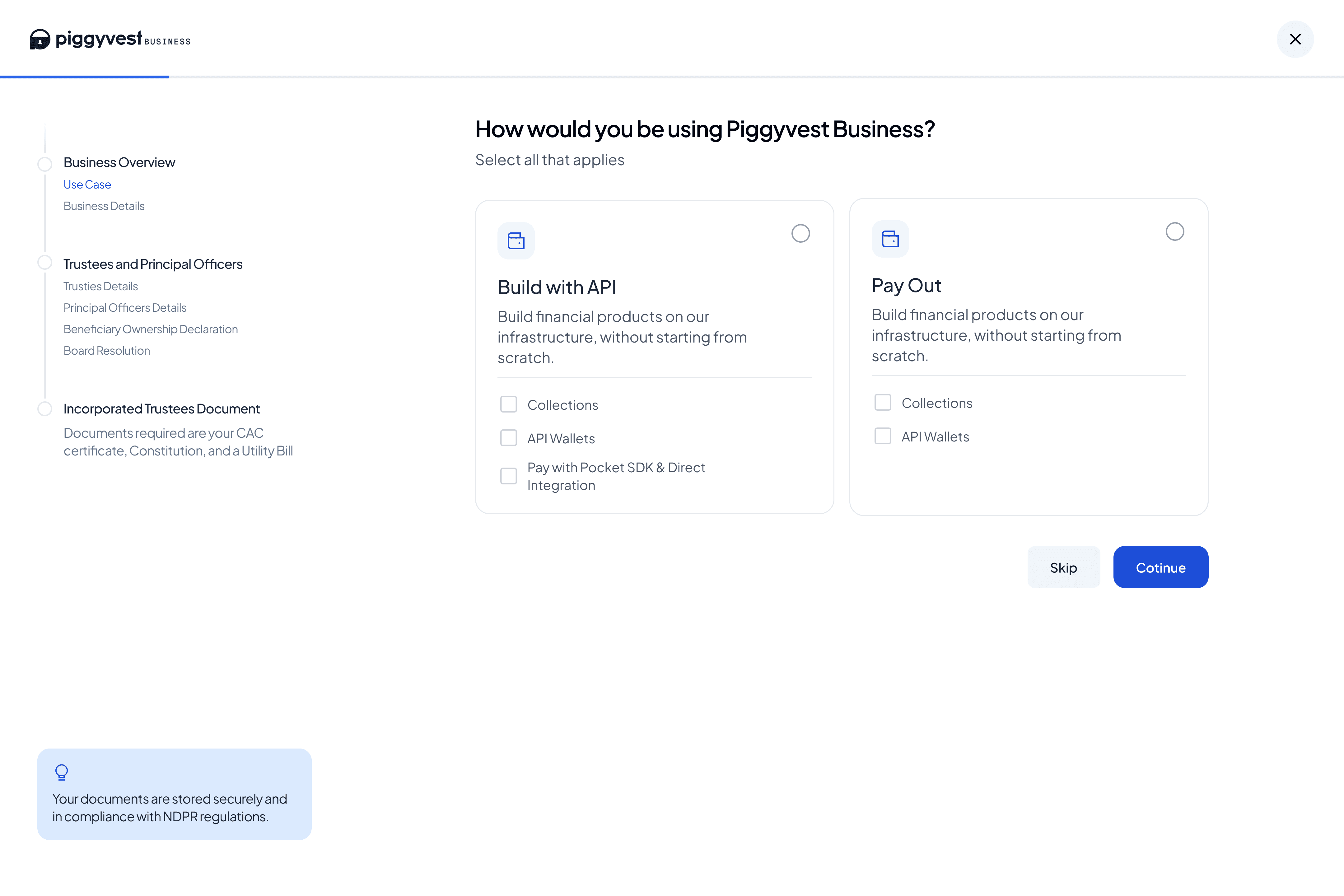
Rather than presenting every required action at the same level, I grouped similar tasks into logical sections with nsub steps. This reduced visual clutter, made the onboarding process easier to scan, and helped users understand where they were and what remained.
Turning Onboarding Into a Guided Journey
Users had little understanding of
How many steps remained
Where they were in the process
What was blocking completion
What I Changed
I introduced:
Persistent progress indicators
Step navigation
Completion states
Clear onboarding milestones
Progress Saving
Outcome
Users always know where they are, what's complete, and what's left to do

Intrpduced a Persistent progress tracker
Provides continuous visibility into onboarding progress and reinforces sense of completion.


Designed for KYC rejection scenarios by clearly communicating the reason for failure and directing users to the exact section requiring updates.
Reflections
This redesign wasn't about simplifying compliance, it was about simplifying the experience of becoming compliant.
By helping businesses understand requirements earlier, reducing perceived complexity, and making progress visible throughout the journey, the onboarding experience became easier to navigate without compromising regulatory standards.
The biggest takeaway was that activation doesn't start when users reach the dashboard. It starts from the moment they decide to sign up.
Always on Repeat
Instsgram